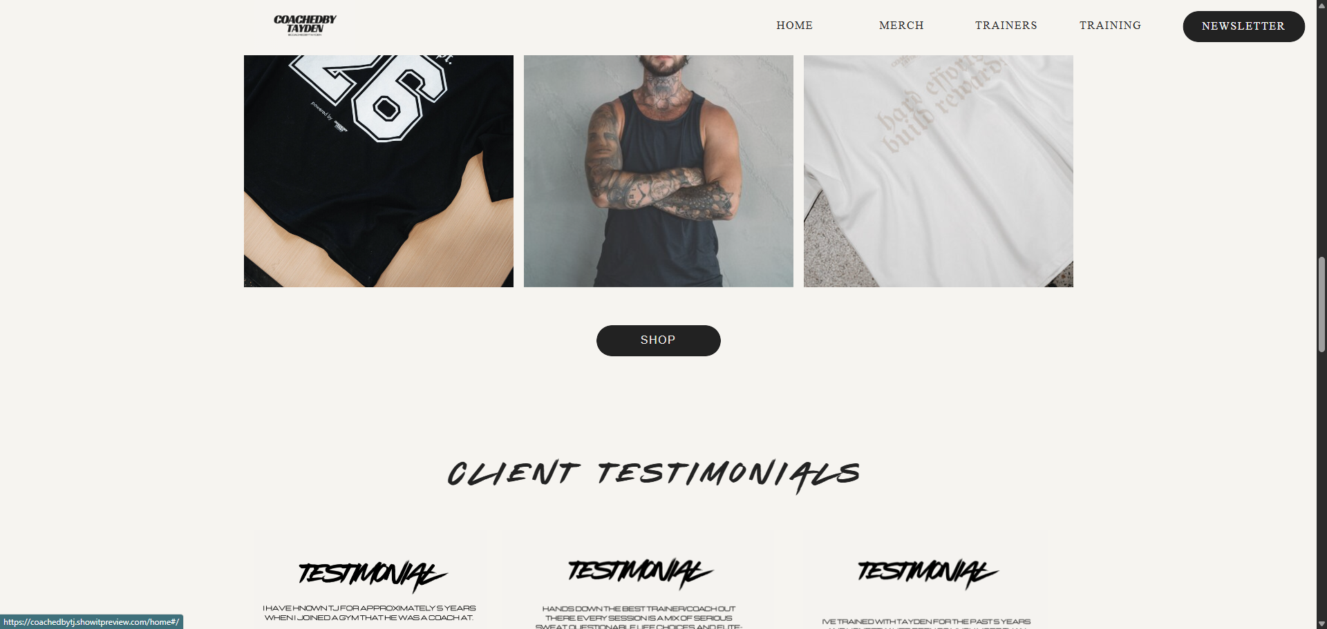
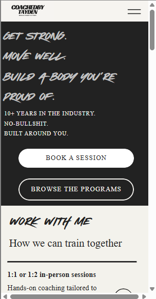
The Client:
Tayden needed a website that felt as raw and no-nonsense as his coaching style. Bold, gritty, built for a serious fitness brand — not another generic PT site. With over a decade of industry experience, his direct, honest approach to strength required an online hub that completely cuts out the fitness industry fluff.
The Approach:
We went dark from the jump. A full-bleed black hero section paired with dynamic, high-energy display typography sets a commanding tone immediately upon load. High-contrast, stark white sections break up the scroll, keeping the user experience moving without losing the design's gritty edge. We built out a highly diverse fitness ecosystem featuring multiple interactive sliders for digital training programs, custom fitness e-books, and structured 1:1 session booking pathways. Additionally, we integrated a full custom merch shop storefront, a clean user review canvas, and a striking newsletter capture section.
The Result:
A Showit website that actually feels like the brand. Bold, fast, high-converting, and completely client-manageable from day one.
The Client:
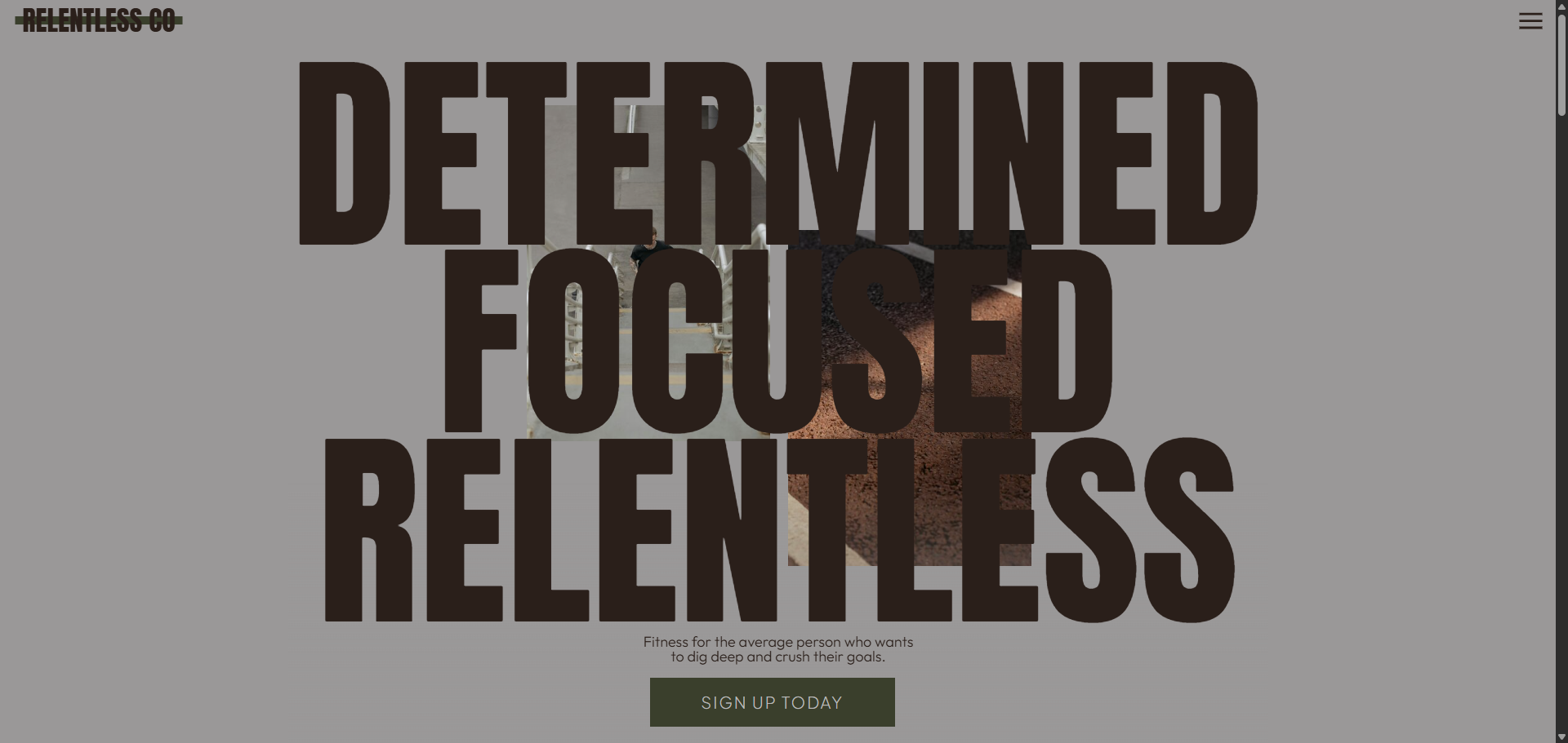
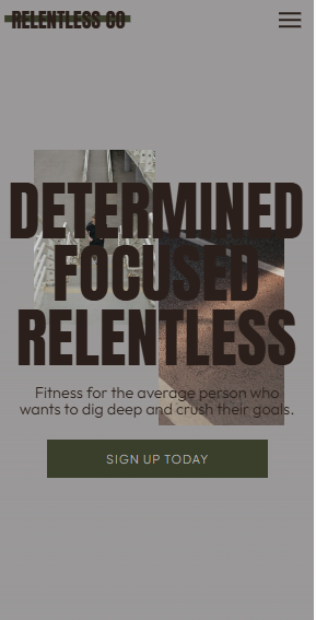
Relentless Co. is a collective of performance-driven personal trainers who reject the soft, clinical approach of trendy boutique wellness. Built explicitly "for the average person who wants to dig deep and crush their goals," they needed a digital identity that felt raw, demanding, and uncompromisingly intense.
The Approach:
We abandoned the bright white backgrounds typical of fitness sites, opting for a gritty, industrial palette dominated by muted concrete grays, deep charcoals, and military earth tones. The layout relies on colossal, blocky display typography that weaves behind and in front of dynamic trainer imagery to establish immediate visual scale. We built a hyper-functional layout optimized for high conversions, framing concrete statistical milestones alongside a comprehensive, multi-column program schedule, 1:1 in-person and online trainer pricing tiers, and an embedded 10-point physical assessment funnel for lead generation.
The Result:
A towering, high-impact digital presence that commands authority from the first scroll. It perfectly positions Relentless Co. as the ultimate destination for no-nonsense physical transformation while providing a friction-free ecosystem for client onboarding and session booking.
The Client:
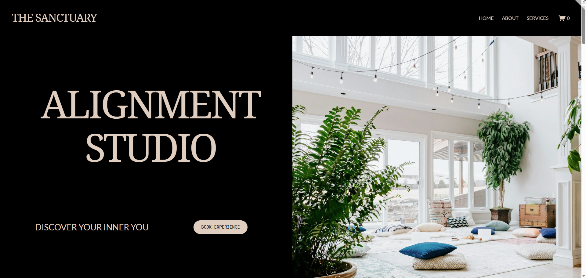
The Sanctuary required an online presence that felt like an immediate exhale. As an upscale somatic wellness center, their digital space needed to look premium, deeply intentional, and specifically tailored to appeal to "the rational mind" looking to escape modern chaos.
The Approach:
We bypassed the clinical look of typical medical spas and the over-used aesthetics of standard yoga studios. Instead, we leaned into a high-end, editorial layout using a warm, calming color palette of soft sands, muted earth tones, and deep charcoals. Elegant, sweeping serif typography gives the brand an instant sense of luxury and quiet luxury. The user experience was designed around tranquility, using generous whitespace and clean, curved image framing. We built out intuitive booking pathways for upcoming retreats, immersive somatic care services, and an integrated e-commerce shop for holistic wellness tools.
The Result:
A breathtaking, minimalist website that acts as a digital sanctuary before a client ever steps foot in the physical space. It balances high-end aesthetics with seamless backend functionality, driving retreat bookings and retail sales effortlessly.
The Result:
A breathtaking, minimalist website that acts as a digital sanctuary before a client ever steps foot in the physical space. It balances high-end aesthetics with seamless backend functionality, driving retreat bookings and retail sales effortlessly.

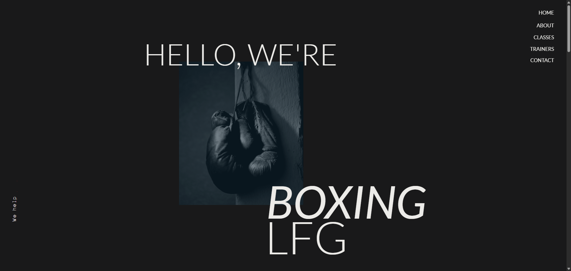
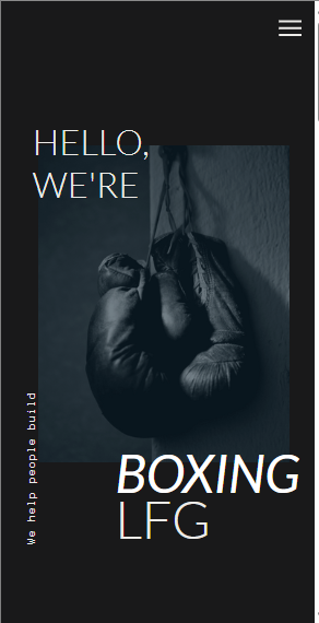
The Client:
Boxing LFG needed a digital home that matched the gritty, high-octane energy of their canvas. They aren't another generic, brightly-lit commercial gym—they needed a website that felt as raw, technical, and no-nonsense as a 15-4 professional fight record.
The Approach:
We went entirely dark mode to set a moody, focused tone right from the hero section. High-contrast, massive editorial typography dominates the screen, paired with textured, high-grain imagery of fighters in motion. We designed a dynamic, asymmetric layout that mimics the fast footwork of the sport, using stark white backgrounds only to break up the scroll and highlight trainer bios. The site architecture was built to seamlessly convert casual visitors into dedicated members, integrating technical class breakdowns, 1:1 elite strategy booking, and a prominent member testimonial section.
The Result:
A striking, high-impact website that commands attention the second it loads. It perfectly captures the gym's "LFG" ethos while remaining blisteringly fast, highly converting, and fully client-manageable.